5 min read
Designing a reading experience, not just a blog
Notes from building this blog — the measure, vertical rhythm, sidebars that stay out of the way, and the small interactions that make long-form text feel considered.
Updated
Most personal blogs are an afterthought. A prose class, a date, a title, done. Which is fine — until you write something long and realise nobody, including you, actually wants to read it there.
This post is a tour of the decisions behind the page you're looking at. None of them are novel; typographers have known this stuff for a century. But it's useful to write down why each one exists, because every single one is easy to undo by accident.
Start with the measure#
The measure is the length of a line of text, usually counted in characters. Too short and your eyes ping-pong; too long and they lose the way back to the start of the next line. The comfortable range is roughly 45–75 characters, and 66 is the number that keeps showing up in the literature.1
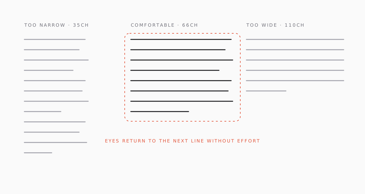
On this site the text column is capped at about 640 pixels on large screens. At 17px body text that lands near 70 characters per line, which is on the generous side of comfortable — deliberate, because code samples and inline identifiers push the average glyph width up.
Why the rails are equal#
The outline lives on the left, and the tags and "more posts" live on the right. Both rails are the same width, which means the text column sits at the true centre of the container rather than being shoved left by a sidebar. Centre the reading, not the chrome.
What happens when the screen shrinks#
Below 1280px the right rail folds underneath the article — its content is still there, it just stops competing for horizontal space. Below 1024px the outline collapses into a native <details> element above the text. No JavaScript, no layout shift, and it costs one line of vertical space unless you open it.
Rhythm over decoration#
The second lever is vertical rhythm: the spacing between things. A heading with too little space above it looks like it belongs to the previous paragraph; too much and the page falls apart into islands.
The rule of thumb I use is asymmetry — more space above a heading than below it. That's what glues a heading to the text it introduces. Here the h2 gets 3.5rem above and 1.25rem below, and the h3 gets 2.5rem and 0.75rem.
Typography is the craft of endowing human language with a durable visual form.
Robert Bringhurst, The Elements of Typographic Style
Quotes are set in the serif, one size up. They're the only place the serif appears in body copy, so a pull-quote reads as a change of voice instead of a change of font.
Headers that earn their space#
Every post opens with a header image. This is partly aesthetic and partly practical: an image gives the page a place — a reason the title sits where it does — and it gives social previews something to show.
If a post doesn't have a cover, the layout generates one: a gradient mesh whose hue is derived from the slug, with the first letter of the title set huge in the serif. Same shape, same weight on the page, zero design work per post. The Geist Mono note uses it.
Sidebars that stay out of the way#
The left rail is an outline of the post — every h2 and h3, in order. It's sticky, so it's visible for the whole read, and the indicator slides to whichever section is currently at the top of the viewport.
The trick to making this useful rather than distracting:
- Low contrast at rest. Inactive items are mid-grey. The active one is near-black and medium weight. Nothing else.
- Motion only on change. The indicator animates when the section changes, and that's it. It doesn't pulse, glow, or track the scroll position pixel-by-pixel.
- Clicking is a real navigation. The URL hash updates, so a reader can copy the link to a section from the address bar.
The right rail is the about column: tags first, because they answer "what is this?", then details, then a short list of other posts. On a brand-new blog with two entries, "more posts" degrades gracefully to "the other post".
The small interactions#
Micro-interactions on a reading page should be felt, not seen. A short list of what's here:
- The progress hairline at the very top of the viewport fills as you scroll. Two pixels tall, spring-eased so it never jitters.
- Heading anchors (
#) fade in when you hover a heading. On touch devices they're always faintly visible, because there's no hover. - Links underline in light grey and step down a pixel on hover, so the underline moves toward the cursor.
- Images blur-fade in — but only if they weren't already in the cache. A cached image renders instantly; there's no point animating something you already have.
- Code blocks reveal a copy button on hover, which flips to a check mark for a couple of seconds after use.
None of these run if the reader has asked for reduced motion.
What I left out#
A few things were on the list and didn't make the cut:
- Comments. Email works.
- View counts. They make the author feel things and give the reader nothing.
- A dark-mode toggle. The site follows the system setting, and every colour in the code theme has a light and a dark value baked in.
- Estimated scroll depth analytics. See "view counts".
That's the whole system. Text in the middle, an outline on the left, context on the right, and a header that gives the page a place to begin.
Footnotes#
-
Bringhurst suggests 45–75 characters for a single-column page, with 66 as "widely regarded as ideal". Butterick's Practical Typography says 45–90 and immediately hedges. Everyone agrees it isn't 140. ↩